


Color is one of the most powerful tools in a designer’s toolkit. It influences how users perceive a product, guides their attention, and evokes emotions. For UI/UX designers, crafting an effective color palette is essential for creating visually appealing and user-friendly interfaces.
In this post, we’ll explore how to build UI color palettes that are functional, harmonious, and aligned with your brand's identity.
Why Color Matters in UI Design
Colors do more than make your interface pretty. They:
-
Influence mood and perception
-
Improve readability and usability
-
Guide user behavior and attention
-
Enhance brand recognition
Keyword Highlight: UI design color theory, importance of color in UX, color psychology in UI
Understanding the Basics of Color Theory
Before creating a color palette, you need a basic understanding of color theory. Here are some essential terms:
-
Hue: The base color (red, blue, yellow, etc.)
-
Saturation: The intensity or purity of the color
-
Brightness: How light or dark a color is
-
Contrast: The difference between colors to ensure readability
-
Complementary Colors: Opposites on the color wheel; they stand out
-
Analogous Colors: Colors next to each other on the wheel; they blend well
Keyword Highlight: color theory for designers, UI color relationships, hue saturation contrast
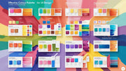
Steps to Create a UI Color Palette
1. Define Your Brand’s Identity
Your color palette should reflect your brand personality. A healthcare app might use calming blues and greens, while a gaming platform could go bold with purples and reds.
Keyword Highlight: brand color strategy, color for branding, color and identity design
2. Start with a Base Color
Choose a primary color that will dominate your interface. This is usually tied to your brand’s core message and emotion.
Keyword Highlight: primary UI color, dominant color in design, base color in interfaces
3. Add Supporting Colors
Pick secondary and tertiary colors to complement your base. These add variety and depth without overwhelming the user.
-
Secondary: For buttons, highlights, hover states
-
Tertiary: For backgrounds, illustrations, or additional accents
Keyword Highlight: secondary color use, UI color harmony, supporting design colors
4. Include Neutrals
Neutrals like whites, grays, and blacks are crucial for text, backgrounds, and balance. They provide contrast and readability.
Keyword Highlight: neutral color usage, contrast in UI, gray scale for design
5. Test Contrast and Accessibility
Ensure your color combinations meet WCAG contrast guidelines. This is especially important for body text, buttons, and interactive elements.
Use tools like:
-
Contrast Ratio Checker
-
Stark (Figma plugin)
-
Adobe Color Accessibility tools
Keyword Highlight: color contrast testing, accessible UI colors, WCAG compliance for designers
Tips for Choosing UI Colors
-
Limit the Palette: Stick to 3–5 main colors to avoid visual clutter
-
Be Consistent: Use color systematically across components
-
Think About Emotions: Blue = Trust, Red = Urgency, Green = Growth
-
Mind Cultural Meanings: Colors can mean different things in different cultures
-
Design in Context: Always test colors on real UI mockups
Keyword Highlight: emotional impact of color, color consistency, UI palette best practices
Tools for Building Color Palettes
-
Coolors.co – Generate color schemes quickly
-
Adobe Color – Create palettes and test accessibility
-
Happy Hues – Curated palettes with UI previews
-
Material Palette – Material Design-inspired combinations
Keyword Highlight: UI color palette tools, color generator apps, design resources for color
Examples of Great UI Color Palettes
-
Airbnb: Uses calming coral and whites for friendliness and simplicity.
-
Spotify: Dark UI with vibrant greens for energy and clarity.
-
Dropbox: A mix of soft blues and minimal white space for professionalism.
These brands demonstrate how color contributes to usability, brand identity, and emotional connection.
Keyword Highlight: color inspiration from brands, successful UI color schemes, design case studies
Conclusion
Creating an effective color palette for UI design is a balance between art and science. When done right, color improves usability, strengthens brand identity, and enhances the overall user experience. At DesignersMeet.com, we empower designers to make smart, impactful color choices that resonate with users and stand the test of time.