
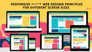


In today’s digital age, users access websites and applications from a wide range of devices—smartphones, tablets, laptops, desktops, and even TVs. As a designer, ensuring that your interface looks and functions well on all screen sizes is no longer optional—it’s a necessity.
This blog explores how to effectively design for different screen sizes, ensuring optimal usability, consistency, and responsiveness across devices.
Why Designing for All Devices Matters
Users expect seamless experiences whether they’re browsing on a 6-inch phone or a 27-inch monitor. A poor mobile or desktop experience can result in:
-
Higher bounce rates
-
Reduced engagement
-
Lower conversions
That’s why modern web design must be responsive, adaptive, and user-centric.
Keyword Highlight: responsive design, multi-device UX, mobile-first design
Understanding Screen Size vs. Screen Resolution
Before you dive into layouts, it’s crucial to understand:
-
Screen size refers to the physical dimensions of a screen (in inches)
-
Screen resolution is the number of pixels on the screen (e.g., 1920×1080)
Designers must account for device pixel ratio (DPR) and viewports to create a consistent experience across displays.
Keyword Highlight: screen size vs resolution, viewport in UI design, device pixel ratio
Key Principles for Multi-Screen Design
1. Responsive Design Frameworks
Use responsive frameworks like Bootstrap, Tailwind CSS, or custom media queries to build flexible layouts that adjust based on screen width.
Keyword Highlight: responsive design frameworks, Bootstrap layout, media queries CSS
2. Mobile-First Approach
Start designing for the smallest screens first, then scale up. This approach ensures the most essential content is prioritized and that your design is efficient.
Keyword Highlight: mobile-first design strategy, progressive enhancement, scalable UI design
3. Flexible Grids and Layouts
Use percentage-based or fluid grids instead of fixed pixel widths. This helps components resize gracefully.
Keyword Highlight: fluid grid system, flexible UI layouts, responsive web grid
4. Scalable Typography and Images
Use relative units like em, rem, and % for text and images. Avoid hardcoding sizes to keep content legible across screens.
Keyword Highlight: scalable fonts, responsive typography, adaptive image sizing
5. Breakpoints and Media Queries
Identify breakpoints where your design should change. Common breakpoints include:
-
320px – small mobile
-
768px – tablets
-
1024px – desktops
-
1440px and above – large monitors
Use CSS media queries to apply different styles at these points.
Keyword Highlight: CSS breakpoints, media queries responsive, adaptive screen design
Best Practices for Designing Across Devices
-
Prioritize Content: Show only what’s necessary on smaller screens.
-
Use Collapsible Menus: Hamburger menus help declutter mobile UIs.
-
Test Frequently: Use emulators or tools like BrowserStack to test on real devices.
-
Touch Targets: Ensure buttons are at least 48x48 pixels on mobile.
-
Minimize Load Times: Optimize images and scripts for slower mobile connections.
Keyword Highlight: mobile UX best practices, touch-friendly UI, device testing tools
Tools for Responsive Design Testing
-
Chrome DevTools – Simulate screen sizes directly in-browser.
-
Figma or Adobe XD – Create responsive prototypes with breakpoints.
-
BrowserStack – Cross-browser and device testing.
-
Responsively App – Free desktop app for viewing designs on multiple screens at once.
Keyword Highlight: responsive design tools, UI testing across devices, prototype with breakpoints
Common Mistakes to Avoid
-
Designing Only for Desktop: A huge percentage of users now browse on mobile.
-
Fixed-Width Layouts: They break easily on small screens.
-
Neglecting Touch Interaction: Desktop designs don’t translate 1:1 to touchscreens.
-
Ignoring Orientation Changes: Designs should look good in portrait and landscape modes.
Keyword Highlight: UI design errors, touch interaction design, screen orientation in UX
Conclusion
Great design isn't just about aesthetics—it's about adaptability. By mastering the art of designing for different screen sizes, you ensure that your product delivers a consistent, engaging, and usable experience for every user, no matter what device they use. At DesignersMeet.com, we help designers stay ahead with strategies that work across screens and platforms.