
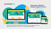


Your customers aren’t just browsing on desktops anymore. They’re using smartphones, tablets, laptops — and everything in between. If your website doesn’t adapt to every screen size, you’re losing traffic, engagement, and sales. At DesignersMeet, we offer responsive website design services that ensure your site looks stunning and functions flawlessly on all devices.
From small businesses to large enterprises, we build websites that deliver a seamless user experience — anywhere, anytime.
Why Responsive Web Design Matters
More than 60% of all web traffic now comes from mobile devices. Google ranks mobile-friendly websites higher, and users expect fast, accessible interfaces that adjust to their screens.
Here’s what a responsive website delivers:
-
Improved User Experience
Your site automatically adjusts layout, images, and fonts for readability and ease of navigation. -
Higher Search Engine Rankings
Google prioritizes mobile-optimized sites for better SEO visibility. -
Faster Page Load Speed
Responsive design means faster load times — especially important on mobile networks. -
Lower Bounce Rates
Users are more likely to stay and engage when the site is easy to use on their device. -
One Website to Maintain
No need for separate desktop and mobile versions — one site works everywhere.
What We Offer in Our Responsive Design Services
At DesignersMeet, we combine creative visuals with smart functionality to design responsive websites that keep your users coming back.
-
Custom Mobile-First Design
We design with mobile in mind first, then scale up to tablets and desktops. -
Cross-Device & Browser Compatibility
Your site will work on Chrome, Safari, Firefox, and across all screen sizes. -
Speed Optimization
We compress images, streamline code, and use smart caching to load fast on all devices. -
Touch-Friendly Navigation
Large buttons, easy forms, and thumb-friendly layouts for smoother mobile interactions. -
Flexible Grids & Layouts
Content automatically resizes and reflows based on screen width. -
Conversion-Driven UI/UX
Our designs aren’t just pretty — they guide users to act, whether it's clicking a button or filling a form. -
Performance Testing
We rigorously test your website’s performance on real devices before launch.
Ideal For:
-
Startups & Small Businesses
-
E-Commerce Brands
-
Bloggers & Influencers
-
Corporate Portfolios
-
Event & Booking Sites
-
Nonprofits, Schools, and More
No matter your industry, responsive design is non-negotiable — and we make it work beautifully.
Our Design Process
-
Research & Planning
Understand your business goals, target audience, and user behavior. -
Wireframes & Layouts
Plan responsive structures that adapt across screen sizes. -
Custom Design & Development
Implement flexible grids, scalable images, and clean code. -
Testing Across Devices
Real-device testing to ensure your site works everywhere. -
Launch & Ongoing Support
Launch confidently and rely on our team for updates and upgrades.
What Our Clients Say
"Our old site looked terrible on phones. DesignersMeet redesigned it to be responsive and our mobile traffic now converts better than desktop!" – Hema K., Travel Blogger
"We saw a 45% drop in bounce rate after switching to a mobile-friendly site built by DesignersMeet." – Ajay N., SaaS Founder
Make Your Website Work Everywhere
In today’s mobile-first world, your business needs a website that adapts and performs. At DesignersMeet, our responsive web design services ensure your visitors have a smooth, engaging experience — no matter how they access your site.
👉 Go mobile-first with DesignersMeet. Visit DesignersMeet.com today.
Keywords: responsive website design India, mobile-friendly web design, device-compatible website, mobile-first design agency, adaptive UI design, DesignersMeet responsive services