


Color is a powerful tool in design, capable of evoking emotions, creating visual interest, and influencing user behavior. Understanding color theory is essential for designers aiming to create harmonious, impactful, and user-friendly designs.
In this blog, we’ll explore the basics of color theory and how designers can apply these principles to enhance their work.
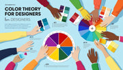
What is Color Theory?
Color theory is a set of guidelines and principles that explain how colors interact, combine, and influence perception. It covers aspects like the color wheel, color harmony, contrast, and the psychological effects of colors.
Keyword Highlight: color theory definition, color wheel for designers, color harmony principles
The Color Wheel
The color wheel organizes colors in a circle to show relationships between them. It includes:
-
Primary colors: Red, blue, and yellow—cannot be created by mixing other colors.
-
Secondary colors: Green, orange, and purple—created by mixing primary colors.
-
Tertiary colors: Combinations of primary and secondary colors.
Keyword Highlight: primary colors, secondary colors, color wheel basics
Color Harmonies
Using color harmonies helps create pleasing color combinations:
-
Complementary colors: Opposite each other on the wheel, e.g., blue and orange; create high contrast.
-
Analogous colors: Next to each other, e.g., blue, blue-green, and green; create harmony.
-
Triadic colors: Three colors evenly spaced, e.g., red, yellow, and blue; offer balance and vibrancy.
-
Monochromatic colors: Variations in lightness and saturation of a single color; create subtlety.
Keyword Highlight: complementary colors, analogous color scheme, triadic colors
Psychology of Colors
Colors evoke emotions and associations, which can influence user perception and behavior:
-
Red: Energy, urgency, passion.
-
Blue: Trust, calm, professionalism.
-
Green: Growth, health, tranquility.
-
Yellow: Optimism, attention, warmth.
-
Purple: Luxury, creativity, mystery.
Keyword Highlight: color psychology in design, emotional impact of colors, color meanings
Applying Color Theory in Design
-
Choose a primary color aligned with brand identity and purpose.
-
Use contrast wisely to enhance readability and highlight key elements.
-
Limit the color palette to 3-5 colors for consistency.
-
Test color combinations for accessibility to ensure all users can perceive the content.
Keyword Highlight: color palette design, color contrast accessibility, brand colors
Tools for Color Selection
-
Adobe Color: Create and explore color palettes.
-
Coolors: Generate color schemes quickly.
-
ColorZilla: Browser extension for color picking.
-
Contrast Checker: Evaluate color contrast for accessibility compliance.
Keyword Highlight: color selection tools, color palette generators, accessibility contrast checkers
Conclusion
Mastering color theory basics empowers designers to craft visually appealing, emotionally resonant, and accessible designs. Whether you’re working on branding, UI, or marketing materials, applying the right colors enhances your message and user experience. At DesignersMeet.com, we help designers harness the power of color to elevate their creative projects.